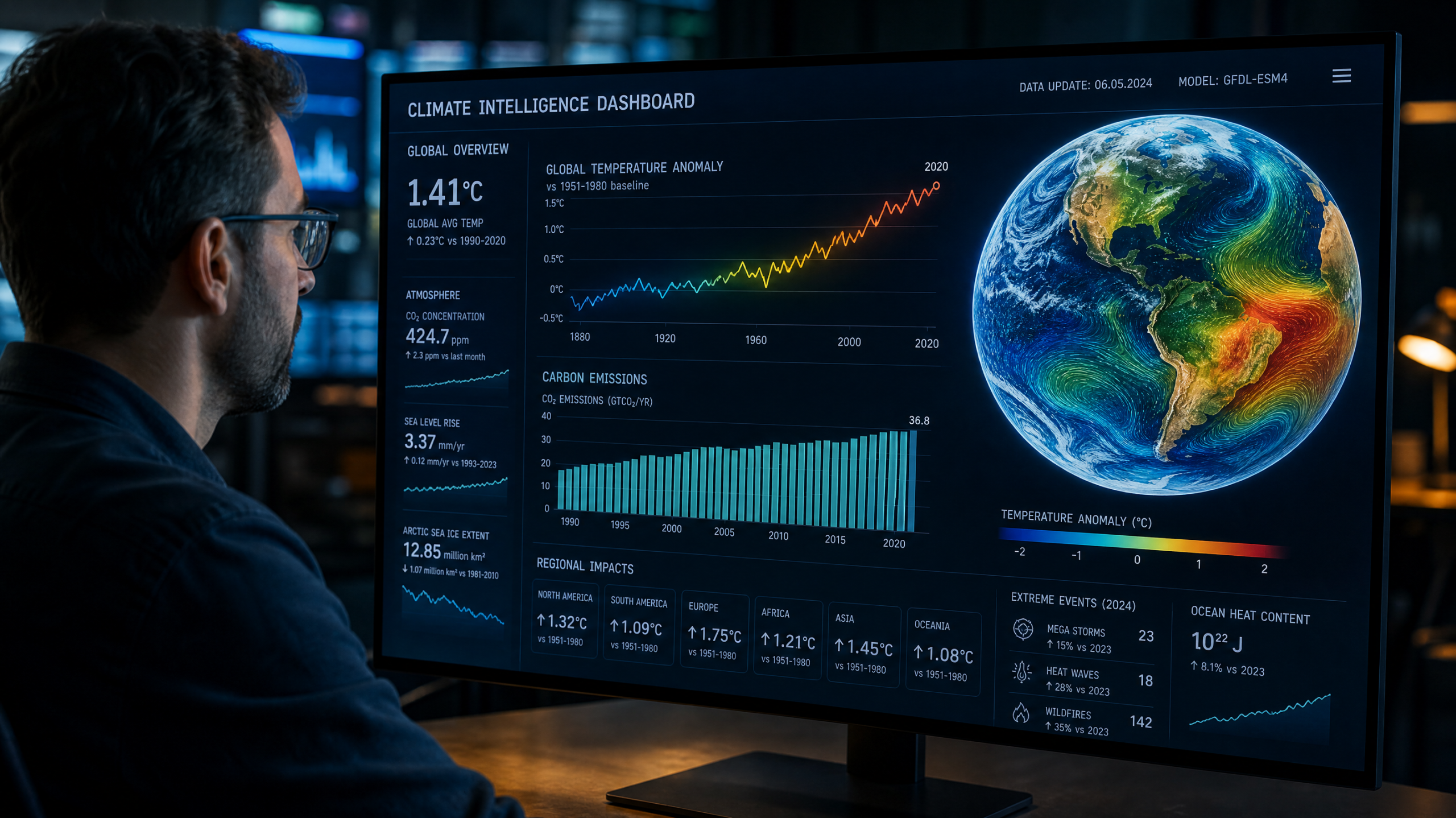
What a Climate Dashboard Is
A climate dashboard is a public, interactive display of the key measurements scientists use to track the state of the planet. Rather than a single number, it presents a suite of indicators — global surface temperature, atmospheric carbon dioxide, sea level, Arctic sea ice, ice-sheet mass — each shown as a graph stretching back decades or more. The data come from satellites, ocean buoys, weather stations, and observatories, and they are updated continuously, so what students see is not a stylized illustration but the real, current record. NASA’s global temperature record, for instance, reaches back to 1880, and the atmospheric carbon dioxide curve has been measured at Mauna Loa Observatory in Hawaii since 1958.
This is what makes a dashboard such a powerful teaching tool: it is authentic. Students are not working with sanitized practice numbers but with the same data professional climate scientists analyze. That authenticity raises the stakes and the engagement, and it means every lesson in reading the dashboard is a lesson in reading real-world data — the kind of data students will encounter for the rest of their lives in news reports, public debates, and their own fields of work. The climate happens to be the subject, but the deeper skill being built is universal: how to look at a graph of real measurements and understand what it is, and isn’t, telling you.
Signal vs. Noise: The Trend Beneath the Wobble
The first and most important statistical lesson a climate dashboard teaches is the difference between a long-term trend and short-term variability — between signal and noise. Look at the global temperature graph and you’ll see it does not rise smoothly; it jitters up and down from year to year, with some years warmer and some cooler than the ones before. A naive reader might seize on a single cool year and conclude that warming has stopped, or on one hot year as proof of catastrophe. The statistically literate reader learns to look past the wobble to the underlying trend — and the trend, smoothed over decades, is unmistakably upward.
This distinction is one of the most valuable ideas in all of statistics, and the dashboard makes it concrete. Students learn that you cannot judge a trend from one or two data points, that natural variability produces year-to-year swings around a longer pattern, and that scientists use tools like a running average — smoothing the data over several years — to reveal the signal hiding in the noise. NASA notes that the ten most recent years are the warmest in its entire record, a pattern visible only when you step back from the individual bumps and read the curve as a whole. Learning to separate signal from noise inoculates students against a whole class of errors and manipulations, in climate and far beyond it.
Baselines and Anomalies: Compared to What?
A climate dashboard quietly teaches another deep statistical idea: that most meaningful numbers are relative. Temperature data are usually shown not as raw degrees but as an anomaly — the difference from a long-term average, or baseline. NASA, for example, plots how each year compares to the average from 1951 to 1980, while preindustrial comparisons use the late-1800s as the reference point. Students who encounter this for the first time often find it puzzling, and working through why scientists do it is a genuine education. A raw global temperature is hard to interpret, but a departure from a stable baseline immediately shows whether things are warmer or cooler than normal, and by how much.
Grasping baselines and anomalies teaches the essential statistical habit of asking “compared to what?” Students learn that the choice of baseline shapes how a number reads, and that comparing against a well-chosen reference is what gives a figure meaning. This is the same reasoning that underlies test scores, economic indicators, and medical reference ranges — nearly any number worth understanding is understood relative to something else. The dashboard turns this abstract principle into a vivid, repeated experience: every point on the graph is a comparison, and reading it correctly means knowing the baseline it’s measured against. Students who internalize this stop taking bare numbers at face value and start asking the question that unlocks them.
Core Concepts on the Dashboard
Trend vs. noise: the long-term direction beneath year-to-year wobble.
Baseline & anomaly: every value measured against a reference average.
Correlation: two variables that move together — and what that does and doesn’t prove.
Uncertainty: the range around a measurement — a strength, not a weakness.
Reading Graphs Critically
Climate dashboards are made of graphs, and learning to read graphs critically is a core component of statistical literacy. Students learn to look first at the axes — what is being measured, in what units, over what range of time — before drawing any conclusion. They learn that the same data can look alarming or reassuring depending on how a chart is drawn: a truncated vertical axis can exaggerate a change, while a stretched horizontal axis can flatten one. They learn that the time window matters enormously, and that cherry-picking a short, unrepresentative stretch is one of the most common ways data gets misused. A graph that starts at an unusually warm year, for instance, can be made to suggest cooling that the full record contradicts.
This critical eye is precisely what protects people from being misled, and the climate conversation is a rich training ground for it because the same real data gets presented in honest and dishonest ways all the time. Students who have learned to interrogate a chart — to check its axes, question its time range, and ask whether it shows the full picture — develop a defense against manipulation that serves them in every domain where numbers are used to persuade, from advertising to politics to their own social media feeds. The dashboard, presenting the authoritative full record, gives them a trustworthy reference against which to test the cropped and skewed versions they’ll inevitably encounter elsewhere.
Correlation, Causation, and Attribution
When students place the carbon dioxide graph next to the temperature graph, they notice the two have risen together, and this opens one of the most important and most misunderstood ideas in statistics: the relationship between correlation and causation. Two things moving together is a correlation, and correlation alone does not prove that one causes the other. Students learn to be appropriately cautious here — to recognize that a relationship in the data is a clue, not a conclusion, and that establishing causation requires far more than noticing two lines that rise in tandem.
The climate case is an excellent vehicle for this lesson because the science goes well beyond mere correlation. The link between carbon dioxide and warming rests on well-established physics — the greenhouse effect, understood for over a century — and on a process scientists call attribution, in which they test whether observed changes can be explained by natural factors alone or require human influence. Working through this, students learn the difference between a casual “these go together” and a rigorous “we have strong evidence that this causes that.” The NASA carbon dioxide record and its accompanying explanations show how scientists move from observation to mechanism to confident conclusion — a model of careful reasoning that students can apply to any claim that “X is causing Y.”
Uncertainty Is Not Doubt
Perhaps the most sophisticated statistical lesson a climate dashboard offers concerns uncertainty. Real data come with error bars, ranges, and margins, and these are easy to misread as signs that scientists “aren’t sure.” Students learn the opposite: that quantifying uncertainty is a mark of rigor, not of weakness. A measurement reported with a clear range is more trustworthy, not less, than one stated as a single confident-sounding number, because it honestly conveys how precise the knowledge is. Learning to read ranges and confidence intervals — and to understand that “uncertain by a few hundredths of a degree” is very different from “unknown” — is a crucial and often-missing piece of statistical literacy.
This lesson matters far beyond climate, because uncertainty is everywhere in real data and is constantly exploited by those who wish to manufacture doubt. Students who understand uncertainty properly can hold two ideas at once: that a conclusion can be both uncertain in its precise details and highly confident in its main thrust. They learn that science rarely deals in absolute certainty, that it expresses what it knows in terms of probability and confidence, and that this is a strength of the method rather than a flaw. That mature relationship with uncertainty — neither demanding impossible certainty nor dismissing strong evidence because it isn’t perfect — may be the single most valuable habit of mind the dashboard can teach.
| On the Dashboard | The Statistical Skill It Builds |
|---|---|
| The jagged temperature line | Distinguishing trend from short-term variability |
| Anomaly values | Baselines and relative comparison — “compared to what?” |
| Axes and time ranges | Reading graphs critically; spotting misleading framing |
| CO2 vs. temperature | Correlation, causation, and attribution |
| Error bars and ranges | Understanding uncertainty and confidence |
Why Statistical Literacy Matters
The skills a climate dashboard builds reach far beyond any single subject, because we live in a world run on data. Citizens are constantly asked to make sense of statistics — about health, the economy, crime, risk, and yes, the environment — and to make decisions and vote on the basis of them. A population that cannot read a graph, that confuses correlation with causation, that mistakes noise for trend or uncertainty for ignorance, is a population easily misled. Statistical literacy is, increasingly, a core competency of informed citizenship, and the climate dashboard is one of the most engaging ways to build it.
There is also a quieter benefit: empowerment. Students who can go to an authoritative source, pull up the real data, and interpret it for themselves are no longer dependent on others to tell them what to think. They can check a claim against the evidence, distinguish a sound argument from a slick one, and form their own grounded view. In an information environment thick with spin and misinformation, that capacity for independent, evidence-based reasoning is precious. The dashboard teaches students not what to conclude, but how to look — and how to look is the more durable and more democratic gift.
Using a Dashboard in Class
Putting a climate dashboard to work is straightforward and free. Pull up an authoritative source like NASA’s Vital Signs or NOAA’s Global Climate Dashboard and let students explore the graphs directly, asking them to describe what they see before interpreting it. Guided questions sharpen the learning: What is the overall trend? Where is the noise? What baseline is this measured against? What would this look like if you only showed the last five years? Comparing how the same indicator appears across different reputable sources teaches students that good data is reproducible and that independent analyses tend to agree.
From there, the dashboard supports rich, cross-curricular work. Students can download data and build their own graphs, practicing the very visualization skills they’re learning to critique. They can calculate running averages, compare decades, or correlate two indicators and discuss what the relationship does and doesn’t show. They can hunt for examples of misleading climate charts online and use the authoritative dashboard to debunk them — an exercise that builds both statistical and media literacy at once. Treat the dashboard not as a one-time demonstration but as a recurring reference, and students will return to it with steadily sharper eyes, reading real data the way a scientist does.
Frequently Asked Questions
What grade levels can use a climate dashboard?
All levels, scaled appropriately. Younger students can read trends and describe what a graph shows, while older students can work with baselines, running averages, correlation, and uncertainty — making the dashboard a tool that grows with the class.
Where does the data come from?
From scientific agencies that collect it via satellites, ground stations, ocean instruments, and observatories. NASA, NOAA, and similar institutions publish the records openly, and independent analyses generally agree — a sign of reliable data.
Is this a statistics lesson or a science lesson?
Both. The climate is the subject, but the core skills — reading trends, baselines, graphs, correlation, and uncertainty — are statistical and transfer to any field that uses data, which is nearly all of them.
Read the Data, Sharpen the Mind
A climate dashboard is a rare classroom resource: real, authoritative, continuously updated data on a subject that genuinely matters. Learning to read it teaches the durable skills of statistical literacy — trend versus noise, baselines and anomalies, critical graph-reading, correlation versus causation, and the honest handling of uncertainty — that students will use for the rest of their lives.
Open the dashboard, ask good questions, and let students interpret the numbers themselves. They’ll come away not just knowing something about the climate, but knowing how to look at any graph of real data and reason from it carefully — the very skill an information-saturated world most demands.
The most important question about any number: compared to what?
This article is for general educational purposes. Explore the data at NASA’s Vital Signs of the Planet, NOAA’s Global Climate Dashboard, and NASA’s carbon dioxide indicator.
Leave a Reply